Types of Components
React Component Patterns: Choosing the Right Structure as Your App Grows
You are building a customer-support dashboard.
The first version displays a list of tickets. Then the team asks for search, expandable details, loading states, a quick-note form, and a summary panel.
Soon, one component contains almost everything.
You search for guidance and encounter several names:
“Smart components.” “Presentational components.” “Higher-order components.” “Pure components.” “Controlled components.”
It sounds as though React has several competing categories and every component must belong to exactly one.
That is the first misunderstanding to clear up.
These terms describe different aspects of a component. They are not mutually exclusive component types.
A component can focus on presentation, receive a controlled value, and be wrapped in memo at the same time.
We’ll grow the dashboard one requirement at a time and introduce each pattern when it solves a concrete problem.
1. Start with responsibilities, not labels
Our dashboard receives a collection of tickets:
const tickets = [
  { id: "t1", title: "Cannot sign in", status: "open" },
  { id: "t2", title: "Invoice question", status: "closed" },
  { id: "t3", title: "Upload failed", status: "open" },
];
A component is a reusable piece of UI. It receives inputs, called props, and describes what React should display.
The simplest ticket list needs only the data:
function TicketList({ tickets }) {
  if (tickets.length === 0) {
    return <p>No tickets match your search.</p>;
  }

  return (
    <ul>
      {tickets.map(ticket => (
        <li key={ticket.id}>
          <strong>{ticket.title}</strong>
          {" — "}
          {ticket.status}
        </li>
      ))}
    </ul>
  );
}
The list does not need to know where the tickets came from.
They might come from a server, a test fixture, or another component’s state.
Its responsibility is to display the supplied tickets.
This is what developers usually mean by a presentational component.
2. Search introduces a coordinating component
The team adds a search box.
Something now needs to remember the query and decide which tickets to pass to the list.
import { useState } from "react";

function TicketPanel({ tickets }) {
  const [query, setQuery] = useState("");

  const normalizedQuery = query.trim().toLowerCase();

  const visibleTickets = tickets.filter(ticket =>
    ticket.title.toLowerCase().includes(normalizedQuery)
  );

  return (
    <section>
      <label>
        Search tickets
        <input
          value={query} => setQuery(event.target.value)}
        />
      </label>

      <TicketList tickets={visibleTickets} />
    </section>
  );
}
useState gives the component a value React remembers between renders and a setter that requests updates.
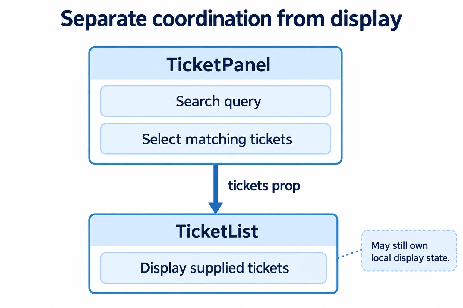
Here, TicketPanel coordinates the interaction:
It owns the search query.
It selects matching tickets.
It supplies the result to the list.
Developers often call a component with this coordinating responsibility a container component.
Older articles may call it “smart” and call the display component “dumb.” The responsibility-based names are more informative.
These names are conventions
React does not inspect a component and declare it a container or presentational component.
The labels describe how we have organized the code.
A component having useState does not automatically make it a container. A display component can manage a tooltip, expanded details, or another local interaction while still mainly handling presentation.
Likewise, a coordinating component can arrange externally supplied data without owning local state.
3. Local interaction can stay beside the UI that uses it
Suppose a ticket row can expand to reveal its ID.
import { useState } from "react";

function TicketRow({ ticket }) {
  const [expanded, setExpanded] = useState(false);

  return (
    <li>
      <button
        type="button"
        aria-expanded={expanded} => setExpanded(previous => !previous)}
      >
        {ticket.title}
      </button>

      {expanded && <p>Ticket ID: {ticket.id}</p>}
    </li>
  );
}
This component has state, but its responsibility remains local presentation.
Moving expanded to the dashboard merely to keep the row “stateless” would add coordination without a requirement for it.
However, if the product requirement becomes “only one ticket can be expanded,” the rows need to coordinate. The parent could then own an expandedTicketId.
Place state according to who needs to coordinate it.
Separating responsibilities should simplify the application, not enforce a naming convention.
4. A shared loading behavior introduces an HOC
Several dashboard sections load data. Each needs to show a loading message before displaying its content.
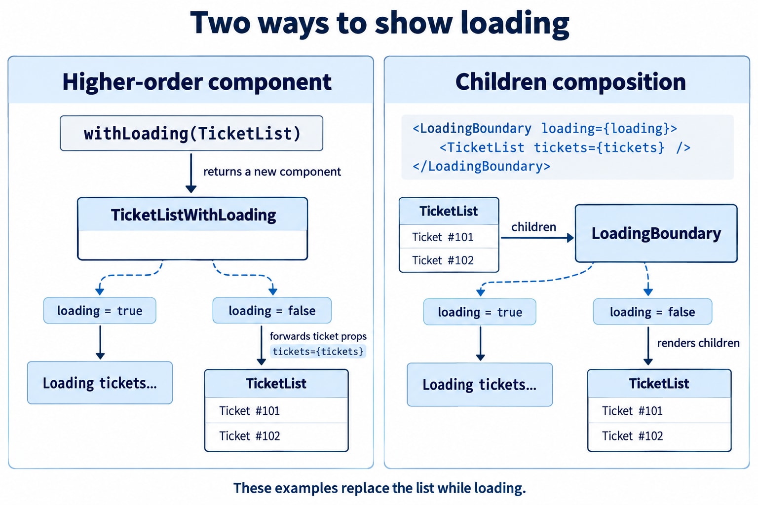
One way to share that behavior is a higher-order component, usually shortened to HOC.
An HOC is a function that receives a component and returns another component.
function withLoading(WrappedComponent) {
  function WithLoading({ isLoading, ...remainingProps }) {
    if (isLoading) {
      return <p role="status">Loading…</p>;
    }

    return <WrappedComponent {...remainingProps} />;
  }

  return WithLoading;
}
Create the enhanced component:
const TicketListWithLoading = withLoading(TicketList);Then use it:
<TicketListWithLoading
  isLoading={isLoading}
  tickets={tickets}
/>
The wrapper handles isLoading. Once loading finishes, it passes tickets and other remaining props to the original component.
...remainingProps is important. A wrapper that forgets to forward props can silently break the component it wraps.
The HOC creates a wrapper; it does not need to modify the original component.
Create the wrapper outside rendering
Avoid this:
function Dashboard({ tickets, isLoading }) {
  const EnhancedList = withLoading(TicketList);

  return (
    <EnhancedList
      tickets={tickets}
      isLoading={isLoading}
    />
  );
}
Each call to withLoading creates a new component type. Repeating that during rendering can cause remounts and lost child state.
Create it once at module scope instead:
const TicketListWithLoading = withLoading(TicketList);Notice the wrapper’s behavior
When isLoading becomes true, this HOC stops rendering the wrapped component. Its local state is therefore discarded if it was previously mounted.
That may be acceptable for initial loading. During background refresh, keeping the existing content visible with a separate loading indicator may be a better experience.
A reusable wrapper still needs explicit product behavior.
5. Composition may express the same requirement more directly
For this simple loading case, we can use a normal wrapper component:
function LoadingBoundary({ isLoading, children }) {
  if (isLoading) {
    return <p role="status">Loading…</p>;
  }

  return children;
}
Then:
<LoadingBoundary isLoading={isLoading}>
  <TicketList tickets={tickets} />
</LoadingBoundary>
Content placed between the tags becomes the children prop.
This approach is called composition: building the interface by combining components.
Both designs can work, and both versions shown replace the children while loading. Composition makes that structure visible at the usage site.
Custom Hooks solve a related but different problem: reusing stateful behavior inside components. They do not automatically replace every reason to use a wrapper.
Choose based on what you need to share:
Requirement | Possible approach |
|---|---|
Shared surrounding layout or conditional UI | Composition |
Shared stateful behavior | Custom Hook |
An API that accepts a component and returns an enhanced component | HOC |
6. “Pure” means two different things in React discussions
The dashboard grows, and someone suggests:
“Make the ticket summary a pure component.”
That sentence could refer to two separate ideas.
Rendering purity
A component’s rendering logic should calculate its output without changing pre-existing external data.
This is problematic:
let renderedTickets = 0;

function TicketRow({ ticket }) {
  renderedTickets += 1;

  return <li>{ticket.title}</li>;
}
Rendering changes a shared variable. Repeating the calculation produces additional external changes.
React may call rendering logic more than once or discard an unfinished render. The component should remain safe under those conditions.
Pure rendering is a correctness requirement for ordinary components too. A component does not become pure merely because we wrap it in an optimization API.
PureComponent, the class API
React also provides a class named PureComponent:
import { PureComponent } from "react";

class TicketCount extends PureComponent {
  render() {
    return <p>{this.props.count} tickets</p>;
  }
}
It shallowly compares props and state to help skip unnecessary rendering.
“Shallow” means it does not recursively inspect every nested field. Object references therefore matter.
Changes to consumed context can still cause rendering. PureComponent is not a guarantee that the component will never run again.
7. memo can help skip repeated work
Suppose a dashboard note changes on every keystroke, while an expensive ticket summary receives unchanged data.
For a function component, memo can help:
import { memo, useState } from "react";

const TicketSummary = memo(function TicketSummary({ tickets }) {
  const openCount = tickets.filter(
    ticket => ticket.status === "open"
  ).length;

  return <p>Open tickets: {openCount}</p>;
});

function Dashboard({ tickets }) {
  const [note, setNote] = useState("");

  return (
    <>
      <label>
        Private note
        <textarea
          value={note} => setNote(event.target.value)}
        />
      </label>

      <TicketSummary tickets={tickets} />
    </>
  );
}
If tickets retains the same reference, memo can skip the summary’s parent-driven re-render.
By default, React compares each prop with Object.is. A newly created object, array, or function is a different reference.
For example, this creates a new array on each parent render:
<TicketSummary tickets={[...tickets]} />memo does not prevent updates from the component’s own state or context it reads. It is a performance optimization, not a correctness mechanism or rendering guarantee.
Measure before adding more optimization
The summary above is intentionally small. It demonstrates comparison behavior; it does not establish that memoization is worthwhile.
If typing is slow, investigate the actual work. Moving note state into a smaller component may remove the unnecessary parent update more simply.
In applications with React Compiler enabled, eligible code can receive automatic memoization, reducing the need for manual memo, useMemo, and useCallback. That depends on the application’s build configuration; it is not something every React project automatically has.
8. Controlled components describe who supplies a value
Our dashboard search uses this input:
function TicketSearch({ query, onQueryChange }) {
  return (
    <label>
      Search tickets
      <input
        value={query} => onQueryChange(event.target.value)}
      />
    </label>
  );
}
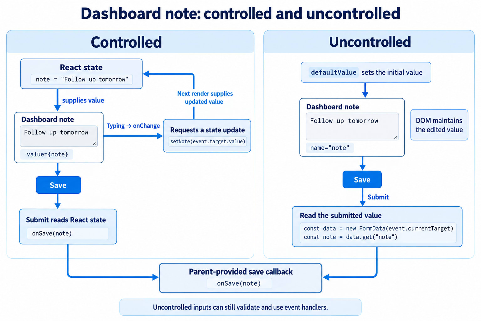
The input’s current value is supplied through query.
When the user types, the component reports the next value. Its owner decides how to update the data.
This is a controlled input.
But controlled components are not limited to text fields. A tab component can receive its selected tab through props. A dialog can receive whether it is open. A ticket row can receive whether it is expanded.
“Controlled” describes where the authority for a particular value lives.
A component can also mix controlled and local behavior—for example, a parent-controlled selection alongside a locally managed tooltip.
For native text inputs, keep value a string and update the backing value in response to editing. Checkboxes use checked instead.
A deliberately read-only controlled input can use readOnly; not every controlled input is editable.
9. A quick-note form can let the browser keep the draft
Another requirement arrives: a small note field whose value is needed only when the user submits.
We can let the DOM maintain the current input value:
function QuickNoteForm({ onSave }) {
  function handleSubmit(event) {
    event.preventDefault();

    const form = event.currentTarget;
    const data = new FormData(form);

    const note = String(data.get("note") ?? "").trim();

    onSave(note);
  }

  return (
    <form
      <label>
        Quick note
        <input
          name="note"
          defaultValue=""
          required
        />
      </label>

      <button type="submit">Save note</button>
    </form>
  );
}
This input is uncontrolled.
defaultValue establishes its initial value. It does not continuously control the edited value.
At submission, FormData reads named form controls. onSave is a callback supplied by the parent; this component does not itself implement storage.
An uncontrolled input can still have event handlers and browser validation. “Uncontrolled” does not mean React cannot interact with it.
A ref is another way to access the input
A ref is an object React can use to give us access to a DOM node.
import { useRef } from "react";

function NoteInspector() {
  const inputRef = useRef(null);

  function showNote() {
    alert(inputRef.current?.value ?? "");
  }

  return (
    <>
      <label>
        Note
        <input ref={inputRef} />
      </label>

      <button type="button"
        Read note
      </button>
    </>
  );
}
After the input is attached, inputRef.current refers to its DOM element.
Reading it in an event handler lets us inspect the current value. Changing a ref does not itself trigger a React render.
A ref is not required for every uncontrolled form; the FormData example already demonstrates an alternative.
10. Choose input ownership from the required behavior
Neither approach is automatically superior.
Requirement | Consideration |
|---|---|
Show a live preview from the current value | Controlled state provides that value during rendering |
Coordinate the value with other components | A controlled interface makes ownership explicit |
Read ordinary fields only at submission | An uncontrolled form with |
Focus or measure a DOM element | A ref provides DOM access |
Handle a very large form | Consider validation, subscriptions, state placement, and measured performance |
Uncontrolled forms can still use native constraints such as required and type="email".
Controlled forms can still perform well when state is placed appropriately.
Avoid switching a native input between controlled and uncontrolled behavior during its lifetime. For example, initialize a controlled text value with "" rather than starting with undefined.
11. One component can have several descriptions
Return to TicketSearch:
function TicketSearch({ query, onQueryChange }) {
  return (
    <label>
      Search tickets
      <input
        value={query} => onQueryChange(event.target.value)}
      />
    </label>
  );
}
It is:
A function component.
Focused on presentation and interaction.
Controlled through its
queryprop.Eligible for memoization if that proves useful.
Those descriptions do not compete.
Likewise, TicketPanel can own state, coordinate a search, use a custom Hook, and render presentational children.
A clearer way to organize the terminology is by the question each term answers:
Question | Relevant concept |
|---|---|
How is the component written? | Function or class |
What responsibility does it have? | Coordination or presentation |
Does it manage remembered data? | Stateful or stateless |
How is behavior or structure reused? | Custom Hooks, composition, or HOCs |
Can repeated rendering work be skipped? |
|
Who supplies the authoritative value? | Controlled or uncontrolled |
The dashboard now has understandable boundaries
The ticket panel coordinates the search. The list displays supplied tickets. A row may own its local expansion state.
A loading wrapper handles a shared display concern. Memoization remains a measured optimization. Each form chooses where its draft should live based on the required behavior.
The purpose of these patterns is to make responsibilities clear.
Before adding another abstraction, ask:
What behavior needs to be shared?
Who owns the data?
What should survive an update or loading transition?
Is repeated rendering actually expensive?
Does this structure make the component easier to use correctly?
Those questions help you choose a pattern for a reason—and recognize when a simple component is already enough.